Fonts with Attitude
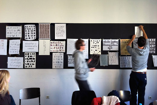
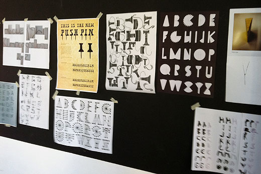
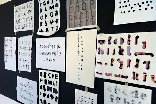
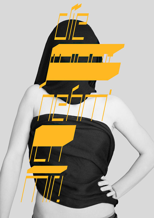
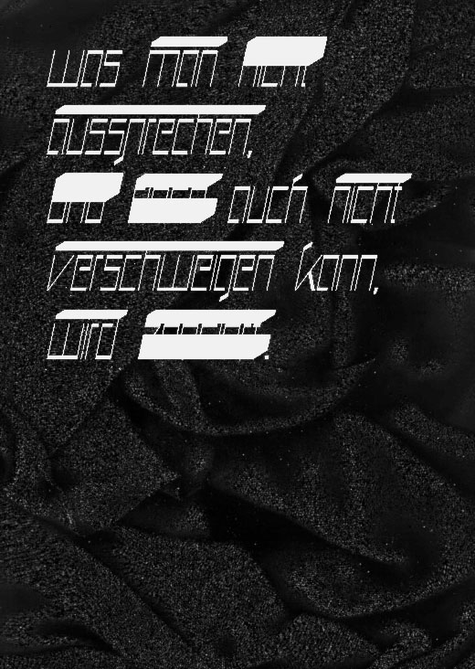
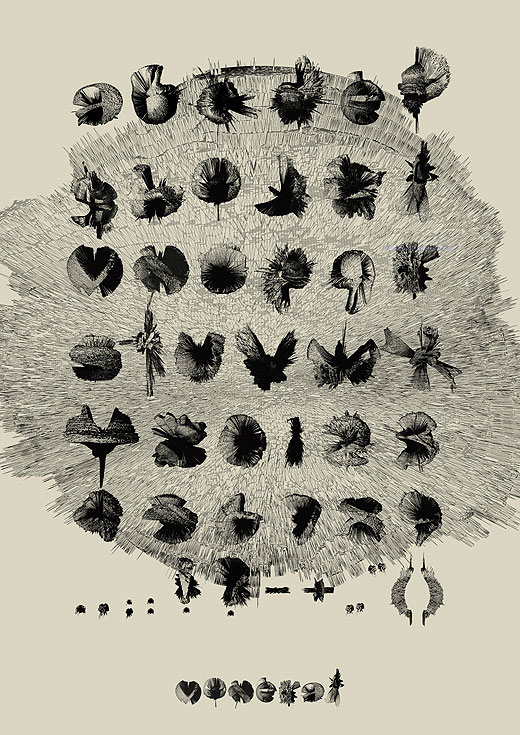
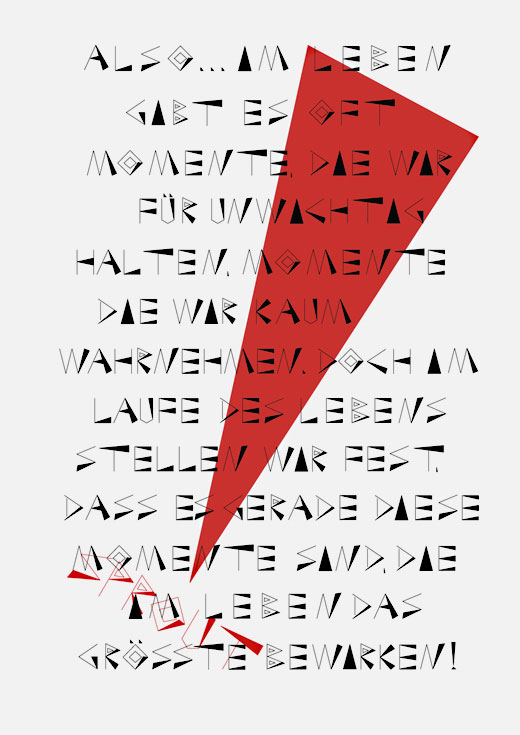
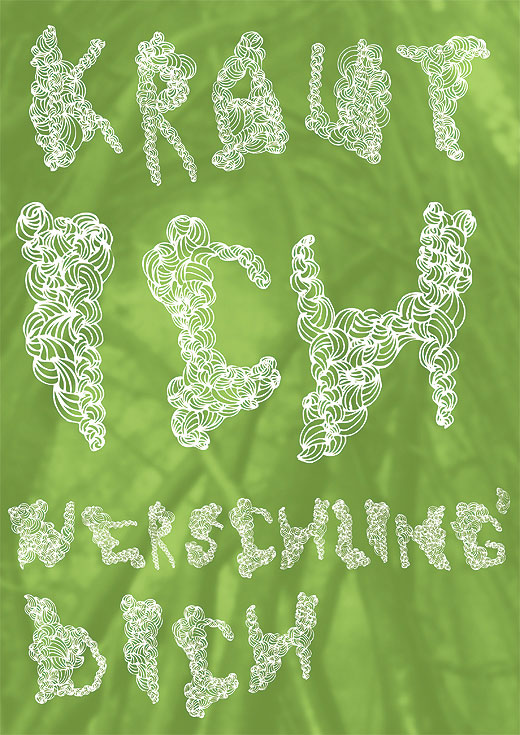
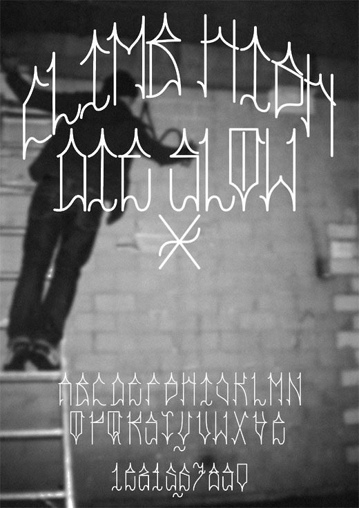
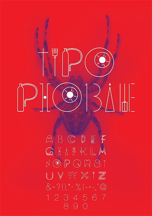
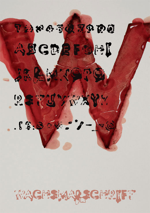
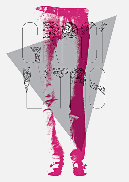
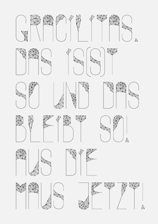
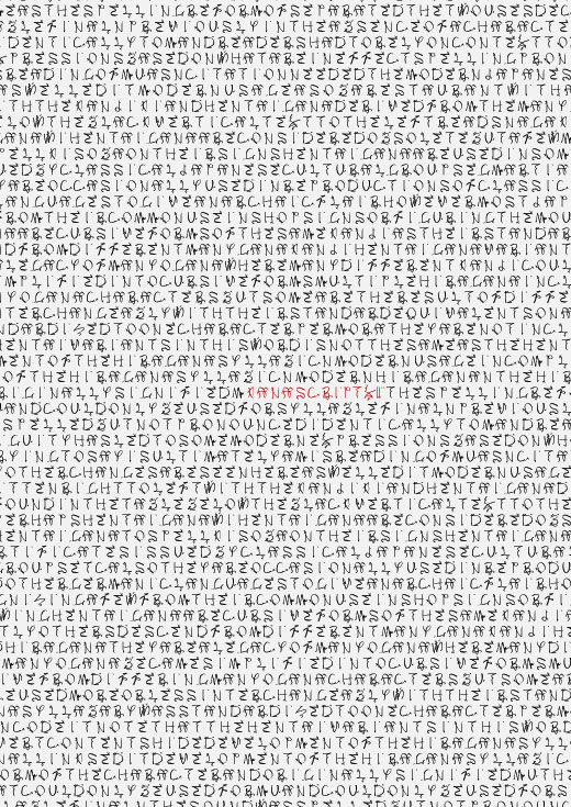
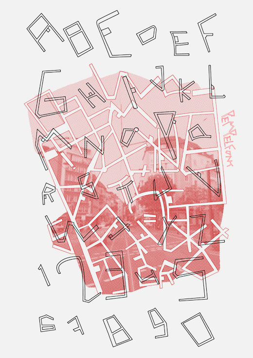
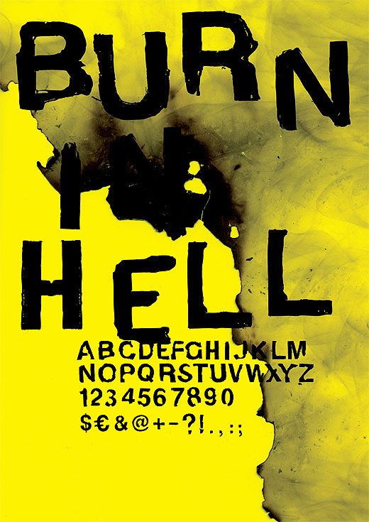
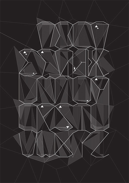
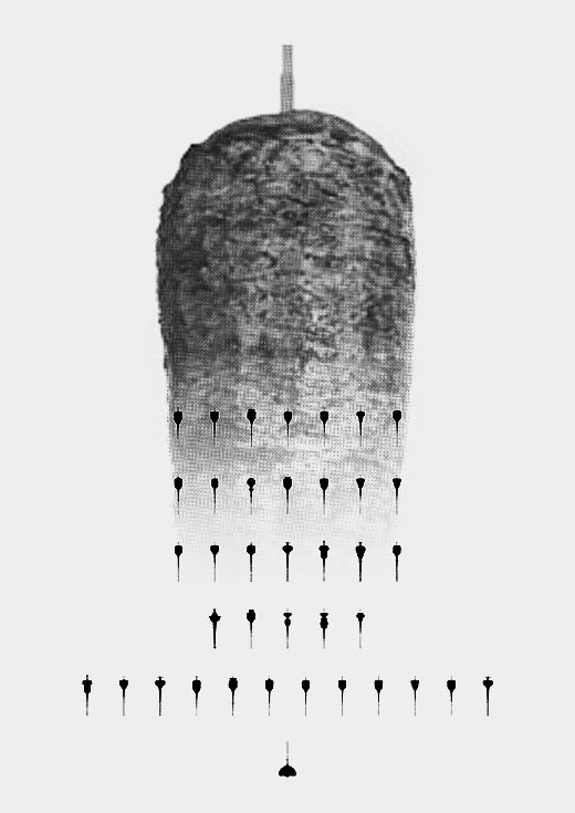
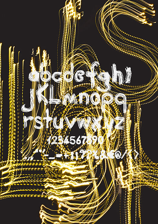
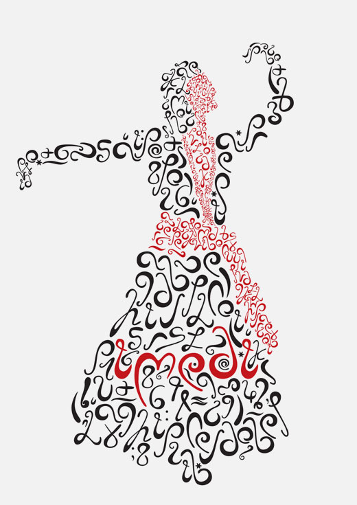
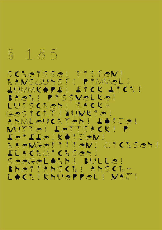
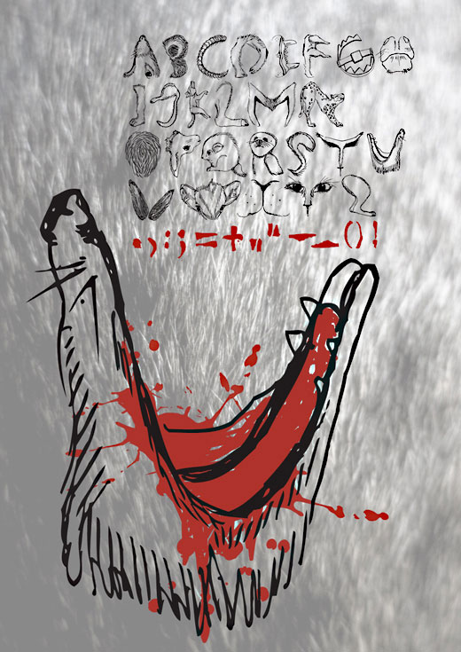
There is no such thing as a neutral typeface. The idea of this first year course was to design a highly personal font. Readability was secondary as it was our aim to explore type design within a political, social and personal context or simply under the aspect of its production process. As a warm-up, each student was asked to design a font from a found object. The final fonts were based on: a sandblaster; muslim veils, minerals, the importance of small events, optic lenses, growing plants, Spanish graffiti, phobias, candle wax, skinniness, brains, Japanese writing, Thai and Arab script, the map of Pempelfort (a part of D³sseldorf), burning hell, digital communication pattern, sound frequencies and doner kebabs, moving lights, greediness, Georgian writing, swear words and animal cruelty. Each font was digitized following a two day Fontlab workshop by our friend Neal Fletcher.
Disclaimer: The copyright of all work shown here is with the individual students. No work shown here was produced by Mind Design or Holger Jacobs.
