Basics in Typography
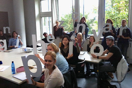
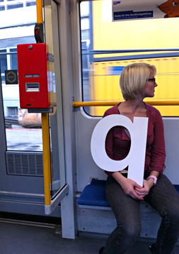
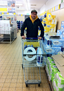
Typography is a lot more than just arranging letters and words within a format. The idea of this first year course was to explore a method of teaching the basics of typographic which is different from the Swiss tradition. A more fundamental or you may call it 'holistic' method. In order to develop a 'relationship' with type each student was given a three-dimensional letter to live with for a week. Like a small child the letter was never meant to be left alone. After this warm-up the course looked at typography within the context of five different aspects: Language, Religion, Sex, Politics and History.Ā
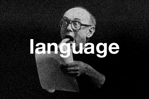
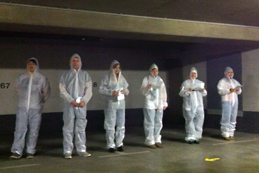
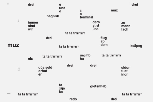
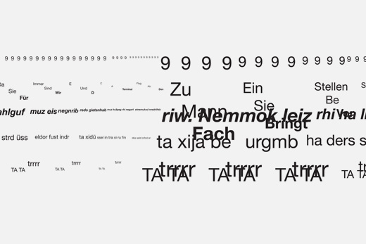
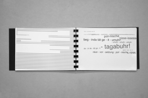
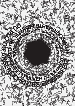
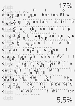
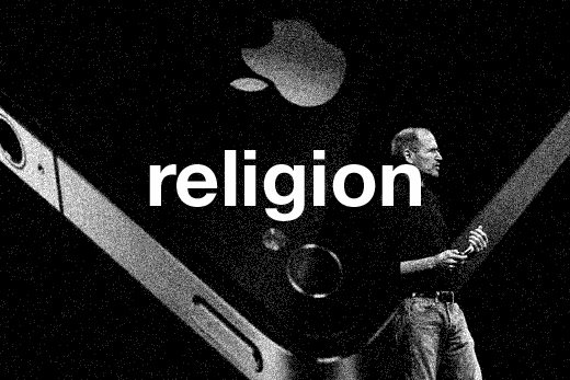
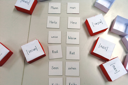
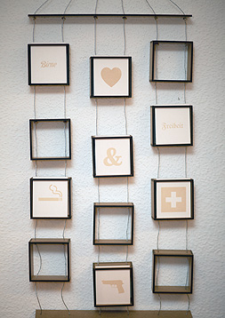
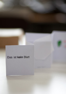
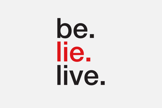
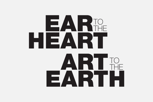
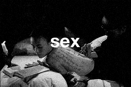
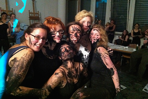
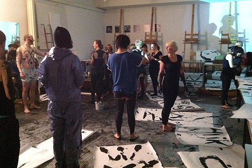
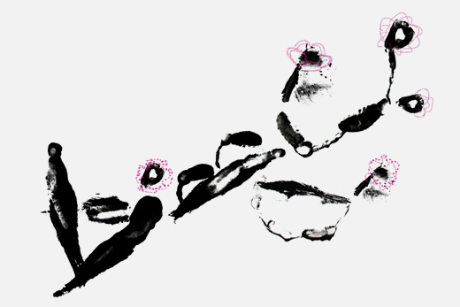
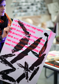
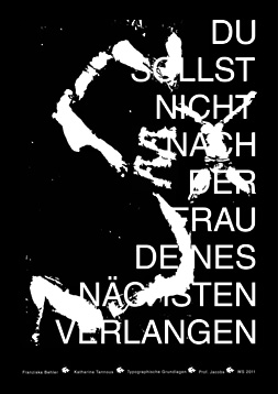
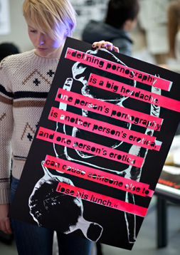
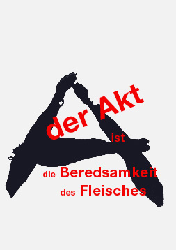
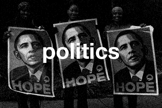
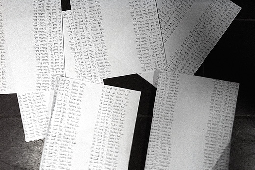
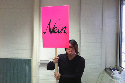
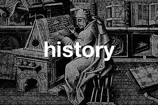
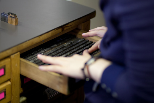
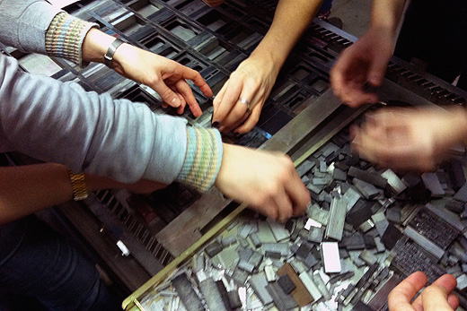
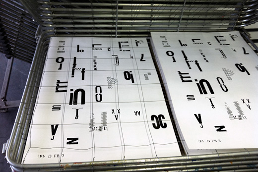
Language: the students were asked to performĀa piece of speech theatre based onĀrandom scripts taken from a chocolate wrapping paper or a taxi receipt. The performance was later visualized following the pronunciation of the text in the play. Religion: the students explored the idea of sign and meaning, designing an 'Advent Calendar' whereby each door led to a different interpretation of a word or image. Sex: after a 'brainy' project it was time to relax and let the body rule over the head. Lava lamps, candle sticks, alcohol, hippie music, some nudity, large rolls of paper and a few buckets of black paint created a hell of a typographic mess. The accidental results of this typographic orgy were made into posters using Helvetica as a contrasting font. Politics: the students where asked to write a nonsense sentence (Ich und Du, M³llers Kuh) a thousand times by hand. No further explanation was given. Almost all students followed the brief without questioning it. The results of this tedious task was put in the bin right after collecting it. Lesson learned: never follow a brief without questioning it, just because it was given by a person of a certain authority. Following this psychological experiment the students looked at the way type manipulates messages by 'modifying' the fonts of official documents, political posters, public information,Āparking tickets,Āetc. History: We looked at how typefaces developed and how the development in printing and reproduction influenced typography as we know it today. To finish the course, each student created the letter he or she started with in the letterpress workshop by using other letters or typographic furniture. The result was a poster that will be used as a folded cover for the course documentation.
Disclaimer: The copyright of all work shown here is with the individual students. No work shown here was produced by Mind Design or Holger Jacobs.
